Monday, November 30, 2009

TIM WAS HERE


This first sketch is of my original idea for our Raquette Lake project. The idea was to build a bridge that broke through a wall and this would be related to overcoming barriers - which would fit well with the Cortland intellectual theme (or whatever it is) of walls/barriers/etc.


This sketch was so I could get a basic understanding of what I wanted to build for Sculpture. Our assignment was to find a wooden chair, take it apart and build a bridge that would span 6 feet and would be able to hold Vaughn. I sketched about half of it to understand how I was going to put the pieces together and I made notes about what I wanted to focus on


This last sketch is an idea I have for a future project. It's simply an idea right now and I haven't taken much time in developing this idea right now. If I make it into the BFA program next semester, I may try and bring this project to life. There aren't many notes or details with it because I already know what I want it to be and what I want to accomplish with it, so adding notes would just be pointless.

Basically, I want to line up 4 tvs or monitors or whatever, so that it forms a box. I want to make 4 of the same animation, but from different angles so that when it's played on the monitors, it's a 3D experience for the viewers. I have a couple other ideas for this, but I don't really want to say much until I begin to flesh this idea out.


One artist I'm looking at is Banksy. I like what he does with stencils because it's quick and easy, yet still accomplishes a job successfully. I'm slowly doing more and more research about him because I really enjoy what he does with mixed media.

Another artist I'm looking at is... I forgot his name. I'll find the link I saved when I get home and then I'll edit this post later.


Most of what I sketch is either to practice areas that I feel I need work in, or early stages of a piece that later comes to a more-whole fruition. For line quality and value change, I've been looking at Taylor White. Her use of subtle line is amazing, and certainlysomething to make note of. I'm always looking at Esao Andrews, for his attention to detail. I've been looking at John Malloy for his use of color, as I've been trying to develop a more sophisticated color pallet. For more surrealist refference, I've been looking at Jaroslaw Kukowski. For content and color, I've been looking at Yuta Onoda.


This page was part of a series of sketches I did work on facial expressions. I was also trying to work out a way to successfully convey hair, that was more life-like than I've done in the past, but still stylized. I think a slight Yuta Onoda reference can be seen here. It's definitely an aesthetic that I'm going to keep pursuing, because I think he embodies a much more refined representation of the lines and shape that I've been drawn to for some time.


This page was part of a concept work-out for Fibers I, based on the idea of the Republican party always having a short-sighted, ill thought out response to current social issues. The first response is often "no," rather than a concise, cogent one. In general, it seems like a group of people that are unable to be reasoned with, because they are entirely impervious to reason.


This page shows the early sketch for the near full-sized Japanese Hannya mask that I eventually made out of plasticine. I've since made a rubber mold, and several wax castings, with the intention of eventually casting them in iron. I've also used the rubber mold to press mold clay for my final ceramics I project. I always fine that preliminary sketches like this one help to identify areas of possible embellishment from the source material, and allows me to put the object into my terms, even if the final media is different.


so the one that looks like a maze to me is like sending hidden messages. After watching some shows with all these people with tattoo's it shows hidden messages or just sending messages out to people who see them. But this one just has my name and my birthday date in it. The second 1 is a doodle of happy rugged bold guy that wants to be cool but really is not. His stance is leaning on a wall and just handing out this could be loaded up and made to look more cartoonist. The bird was just for fun and the colors don't make sense at all but it helps me with layering color or color and shading. When working on photoshop layers on layers is also helpful very different from layering pastel but kind of the same concept.

sketches n such


These three sketches from my sketch book are the original scafolding (I dont think thats not spelled right) for three paintings I am currently working through in Lori's painting II class. The series is based on a monstrous creature (who is very naughty) a knightly-type (who is also naughty in his own violent way) and a clash of the two characters. The knight can be seen with a boar-head helm whereas the monster can be seen with a bald head and a naked distorted body. I drew inspiration for this theme from the story of beawulf (or wolf?) and the novel based on beowulf called "Grendel". Two artists I looked into were Goya (Saturno) and Munch (Puberty and Madonna). I would be happy to put up links to these pieces but I am on an un-familiar computer and I cant seem to make my link-things work. If I have left any questions unanswered feel free to ask and feel free to check out the progress of the paintings! Thanks all! PS everyones stuff looks awesome. -Chimbo


These are some sketches related to some poems that I am currently working on. Recently I have been concentrating on the interpreted meaning of words and how they relate to each other. By combining the imagery related to the words and the developed story I have been trying to depict this mood into imagery to develop the intended message.

These are some artists that I have been recently interested in while their work relates to fibers and not poetry I have been trying to draw inspiration from their instillations. Johanna Scheizer creates figures which are woven into creature like depictions of the human form. While Gerda Steiner and Joer Lenzling create large romantic whimsical instillation. I am particularly fascinated by their work because they work together to on large exhibits. This is such a challenge but in the end they are able to create such magical scenes. .http://fiberartsmixedmedia.ning.com/profile/JOHANNASCHWEIZER
http://www.steinerlenzlinger.ch/

sketchbook drawings

I chose to create this sketch in colored soft pastels. In my life drawing class we had worked with color and the figure but it was always a challenge for me to really grasp it so I wanted to take the chance to work on that with this sketchbook. The inspiration for this was a watercolor image I found on istockphoto.com. It was created by Isabelle Z.-Finet, a German artist born in 1974. You can see some of her work at www.meine-art.com, but unfortunately it is all in French and German.
This is a charcoal sketch...unfinished. I chose to do a lot of my sketch book in charcoal drawings. When doing art work that is outside of the computer my favorite medium is charcoal. I took a life drawing class at Fredonia a year ago and fell in love with it. In a lot of my work I typically use a grayscale color palette and I think that is why I am also attracted to the look of charcoal drawings.
This ink drawing was inspired by a French artist named Lotie. I discovered her work in a UK magazine called Computer Art. She uses a lot of simple line draws but adds a lot of small detail. A lot of her work involves these types of drawings mixed with computer art that have beautiful color gradations. I wanted to try to use this artist as an influence on my work to help push the organic an simplistic feel for art. You can see Lotie's awesome work at www.lotie.com


In the past two years, experimenting with the different kinds of weavings there are (ikats, woven shibori, double weaves, etc) I have become particularly interested in the colors and ideas that come out of the culture of India. I have currently been working on ideas that I will be able to portray in my fibers class for next semester. I have yet to incorporate both surface design and weaving together, except for the simple dying of a white cotton warp. So next semester I am hoping to mend the two together to help me with my ideas.

The first sketch on the left is of an Indian elephant. Elephants being my favorite animal, I created this image as an idea for a silk screen 1- for a printmaking project but 2- also for an idea that may evolve for a weaving as well. I would take the silk screen and print it over the weaving, giving the image more texture behind it. With this idea I wish to also include some current colors or ideologies from our culture.

The second sketch on the left is a layout for a weaving I have already started. With the ideas that come out of India, one we are all familiar with is that of karma. After doing research on the idea, the "purple flame" is one that is supposedly charged with the "light of divine freedom." It burns off karma to come in other lifetimes. I am taking this idea and connecting it with colors that I feel represent this idea in our culture. Sketches for weavings are very simple- seeing as how most patterns that are seen in weavings come from books, the only options are the colors and types of yarns that you use. I am using a pattern that is wavy, and after the weaving is complete I plan to embroider on top of it a pattern of flames of a fire (hence
the quick sketch of flames on the bottom of the page) to give my piece more movement and make it more coherent.

Since my time in drawing 2 and projects with self portraiture, my new doodle while being bored is parts of the face, in particular the eye. The reality that is possible to portray amazes me. To the left is just one of my quick doodles during a class when I was bored, from imagination. I love to try and portray the roundness of the eye. As you can see I always number the sketch to keep in my own mind how many I have drawn, and to keep for my own record in the future. I like to make note of different ways I can improve my sketches as well.


One artist that I have been looking at, particularly for color choices is Julie Evans. She has worked in India, and borrowed the color palettes from the country since the start of her career. Though she works with miniature paintings, she inspires me to use the colors from the Indian culture and add some of my own instincts to pair these colors with others in my weavings.

http://www.saulgallery.com/chronicle/evans_2007.html
http://www.saulgallery.com/evans/statement.html

Another artist I have just recently come upon is Shrikant Kadam. He is an Indian artist who uses the exact colors I always imagine to go along with the Indian culture. He is inspired by nature (who isn't?) and uses abstract forms to portray his ideas. He has made me think that to convey my ideas I could also use these simple, very bold colors, to create a piece that is abstract to the point where you don't know what it is at all, yet the viewer would know that the inspiration came from the Indian culture.

http://shrikantkadam.com/default.asp?pageno=1

Sketches


Well to start, my sketchbook is my personal journal. I free write and sketch out ideas, usually pertaining to my ceramics, but sometimes these small sketches are ideas for my drawings. None of the sketches in my sketchbook are actually completed; they usually take me a short amount of time. I like to sketch them quickly so I can get all of my ideas out before I forget and new ideas arrive. Also with my sketches there is usually always writing whether it is how I feel at the moment or a song lyric or a poem. I think this is something that keeps coming up in my artwork and I need to figure out how to incorporate the writing into my work. I have been looking at work by Hella Jongerius . She does a lot of ceramic work as well as modern furniture design. Her ceramic pieces are beautiful and she has a great way of incorporating her figures into vessel forms. I have also been looking at Ken Fergusons work. He also incorporates his sculptural elements into the vessel forms, and does it in a way with much purposefulness.

My first sketch is actually a sketch that I brought to life in a model in ceramics. I have a lot of these headless figures throughout my sketchbook. They are confused figures looking for their heads or minds. As you can see the figure in this sketch is being overcome by a blanket like form. The blanket of the back of the figure is supposed to represent some sort of emotional burden or weight on the shoulders; something that would bring a person down.

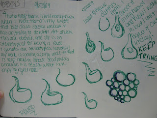
My second sketch is a combination of my free writing and some sketches of a form. This particular form came to me in my sketches one day and after that I decided to bring it to life in ceramics. It is almost like a half pitcher half planter, that’s kind of the only way I am ever able to describe it. With this form, I had a hard time getting it the way that I could see it in my head, therefore I made many models and practiced drawing the form not only in my sketchbook, but also at a larger scale.

My last sketch is again my headless figures. In this particular sketch though I was trying to figure out how to draw one of the arms reaching up and then bending in. I found it difficult to draw because of the way that the 2 segments of the arms overlapped. Also in the top right corner of the page is another sketch of another piece that I made in ceramics. The words and sketch on the left are of a bag. I have been making these sac-like forms out of porcelain that I love and really speak a lot about emptiness.

sketches


This is a sketch i did for a tee-shirt design for aea. It is a lot cleaner than the drawings i usually i do which i usually very sketchy.

I've often drawn and made city scene pieces. I like using simple shapes as the buildings and also simplifying the background. I enjoy taking busy and complicated scenes or objects and breaking them down into geometric shapes and lines.
This is done with paint. like the city scenes, i've often made pieces, specifically paintings where i keep the facial features very simple, and then make the piece more interesting my adding a lot of texture shapes and lines in the background.

I've been playing around with a lot of different ideas this semester to find exactly what i want to focus on next semester when i continue my concentration. I've been looking at a lot of african art, becuase i am very interesting in how they simplify facial features and the figure.

I'm also interested in Lorraine Roy. I enjoy the texture and the many different aspects and colors of the pieces. They remind me of my paintings and made me realize i could bring my style of painting into my fibers work

this first sketch combines two themes that i like to work with. i often like to work with geometric shapes that fit into each other to make a whole, like puzzle pieces almost. i'm working on a fibers piece that goes along with this idea. the other part of this sketch has to do with the colored in triangle. i like to explore the concept of significance. 
I think this sketch is most representative of the way i work/draw. i started out trying to draw a hand and then i got distracted and bored with it so i just started to draw the awkward contour lines around it. then i went to write 'it's hard to draw a hand' so i would remember not to try to draw one again but when i went to write the word 'draw', i accidentally wrote the letter 'b' instead of 'd' so i then changed my phrase to 'it's hard to be a hand'. i really like the way the lines look with the image of the half hand. i like working with contour lines and repeating lines and awkward looking lines. 

This sketch was inspired by an assignment i had last year in my drawing 1 class when we had to draw a striped fabric that was draped over a chair. I liked the way the stripes/lines could describe the shape and movement of the fabric. I wanted this sketch to come out looking like a draped/crinkled/wavy piece of fabric but I dont know how successful i was at accomplishing that. 

one artist that i have been researching is Mariska Karasz, you can see her work at MariskaKarasz.com  - her fibers pieces are really amazing. 

sketches

A lot of my sketches this semester have been in preparation for next semester when I will be focusing more on clothing, and more specifically tee shirt design. I have always been interested with the idea of humans expressing themselves with the clothes that they wear, and the idea of clothing as art. Not in a project runway type of way, but in the casual form of a tee shirt or a hoodie. I have always found myself drawing in a graffiti, cartoonist style and I have been experimenting with placement, color, and size of my drawings on tee shirts. The images that I draw come from many aspects of life. Things such as nature, abstract characters, and technology.

The first three designs below are ones that I have experimented placing on tee shirts.


The Last two images are from a project that I am currently working on in Multimedia. The goal of the project is to create an interactive experience which is visually stimulating for the viewer. the piece has to bring the viewer to different places or rooms with each button that they click. In my piece, I am allowing my viewer to navigate to different places on their own by having the choice of what part of the flower to click.


The first sketch on the upper left corner is a drawing of my friend nick. I drew this from photo reference, and chose to draw this because i really liked the folds in his shirt. i had been doing a few sketches pertaining to drapery and wanted to experiment a bit further with it. The second sketch is of course a sketch of the corpse, it was drawn from observation, and does not even compare to the real deal. While drawing this i was really trying to capture the layers which it was made of. I also really wanted to incorporate the reflecting light from the water, which i believed was the most challenging part of the drawing. The third drawing is of a cake my grandmother made for thanksgiving. This was also drawn from observation, and i chose to draw this because it looks delicious of course, and also because of all the varied textures. The texture the of the icing was what really inspired me to draw this cake; i loved the way it folded over the cake, and the shadows the imbedded strawberries made. All of these sketches are just a collaboration of experimenting with light and texture. I am trying to broaden my drawing capabilities, especially pertaining to figure drawings. Two artists i am currently looking at are Robert Rauschenberg, and Brice Marden. I am inspired by these abstract artists because of their choice of color and shape. I am inspired by Robert Rauschenberg's take on pop art, his work is exciting and has a very diverse appeal to it. His work can be appreciated in a fine arts sense, and also appreciated by the public. I am inspired by Brice Mardens work because it is very similar to the experiments i have been working with. The brilliant line and texture which he uses in his work is something i am trying to accomplish in my own.
Okay well where to begin... Most of the stuff I sketch in my sketchbook are not exactly thumbnails or models for other work visually but most of tests of ideas and concepts I have. I also use it as a bit of a journal or a diary I like to be able to look back on that day or that moment and have it make sense. The first one began because it was a really warm day out. It seemed so out of place in november so I was reminded of the postal service song Sleeping in and it sort of spun off into this. I wanted to create a form that was recognizable as a tree but made up of completely abstracted designs. At this rate maybe some day our trees will be made of plastic.

The second one was just a sketch of some eyes I was working with. I wanted to sort of map out the values without any outstandingly harsh lines but all pretty harsh at the same time. I tried not to pick up my pen and wanted it to seem sort of continuous. I was trying to wrap my head around the idea of how your image of a person changes when you are away from a person. Sometimes their absence creates this perfected image in your memory but at some point their features start to fade and the lines get a little blurry.


For the third one I was exploring basically the same concept of memory as in the second but added some color into it. I am always partial to colorful work but I think that this misses the rawness of the second one. I think next I will attempt to use colored markers without trying to make it too cheesy.

I have been recently researching the work of photographer Cindy Sherman. Her approach to portraying people is very interesting to me. I like the sort of dark humor her work is taking in her more recent photos.
http://www.metropicturesgallery.com/index.php?mode=artists&object_id=4
Another artist I am looking at right now is Cristopher Nolasco. I am really interested in his use of color and medium. His use of bold heavy color but still giving an over all light mood is something I am exploring. http://nolascoart.com/ Okay I think that is all :)


Perspective Sketches

These sketches that I scanned in from my sketchbook are studies using two and one point perspective. I wanted to experiment with how above/below the objects are to the horizon line while also playing around with vanishing points. A common figure among my sketches are bathtubs and beds. This might be due to the fact that the underlying shape to these objects are rectangles, and that is the first shape that it drawn to perspective. I also like the feeling that these floating bathtubs and beds give off. I like how they are the only object in the vast space of the open white background. I can imagine that the background stretches on for miles and miles, making these objects even more mysterious. Although these sketches are only found in my sketchbook, I would like to move them onto canvas. There is a certain quality that the pencil lines on paper give off that makes me curious to see how it will translate over to paint on canvas. Two artists that I have recently been looking at and gave me some inspiration are Anselm Kiefer and Evan Summer. The works by Anselm Kiefer that I have been specifically been looking at are his watercolors and paper. In these watercolors he creates these vast landscapes that incorporate perspective. I really enjoy the atmosphere that he creates using this perspective. When Evan Summer came here and showed his work I was particularly drawn to his one piece titled "Perspective Study". I enjoy this because this is similar to what I drew. There is this object sitting in space that has many perspective lines.


Sunday, November 29, 2009

A series of ceramic project


This sketch was made for a series of ceramic final project. As a painting student, I tried to explore the issue of different perspectives in clay media. The sketch shows three potteries, which have both three dimensional volumes and two dimensional surfaces. I also played with the difference between a perceived volume and an actual volume by combining different dimensions in a way to flatten the visual volume of pots. I made the the organic form to contrast the geometric lines. The negative space creates an outline of another imaginary pottery between pots. Italian ceramic artist, Nino Caruso, helped me in terms of forms while American artist, Andrea Gill, showed me a possibility of various surface decorations on the forms. My interest in multi-layered landscape gave an insight for surface decorations. I placed different layers of various surface treatments so that the viewers would experience a maze of abstract lines, shapes, patterns and colors.

Photo silkscreen project


This was an idea sketch for photo silkscreen project. I looked at the Minimalist artist, Sol Lewitt as a visual source. I was surprised by his complex composition, using a simple geometric rectangular shape and colored lines repeatedly. As an extension of my interest in landscape, I chose to depict the aerial view of city grid that contains a complexity within a simple geometry. It was interesting for me to see how these two opposing characteristics - simplicity and complexity – can coexist on the same surface. Similar mixture of simplicity and complexity is also found in various real landscapes. Another visual source was from the works of Piet Modrian. His fascination of Manhattan city grid helped me in deciding the direction of the project.

A series of abstract landscape paintings


These sketches were created as preliminary ideas for a series of abstract oil refinery landscapes. My study has been focused on abstract landscape painting and the relation between human culture and the nature within its landscape. The large proportion of sky, seen from Janaki Lennie’s paintings, assisted me in deciding the overall composition and layout of visual elements. However, unlike her realistic representation of the landscape, my landscape scene was realized in the French Cubist and Precisionist way, which I admire. I used the works of Julie Mehretu as another visual source to produce my own visual elements. The smoke from the oil refinery is somewhat realistic and is dissolved to the vast, empty sky as a transition of human industries and the nature. An architectural element is added to each painting in order to give the viewers a hint on the viewing points and involve them actively in the landscape scene. The architectonical structure, however, would be hard to digest for many viewers in that it is fractured by the Precisionist handling of paints. It was my intention to make my painting simplified and abstract.